
Dec 22, 2024
Color Psychology in UI Design: More Than Just Hue
Have you ever noticed how some websites make you feel calm, while others make you feel energized? It’s not an accident — it’s color psychology at work. As designers, we often focus on how colors make a design look, but the truth is, color is much more than just an aesthetic choice.
It’s a powerful, non-verbal form of communication that shapes the user experience in ways we might not always consciously realize.
Color goes far beyond its visual appeal, functioning as a subtle yet impactful form of non-verbal communication. From guiding user behavior to evoking emotions, color plays an integral role in shaping the overall user experience. By understanding the psychology behind color, one can design interfaces that not only look good but are highly functional, engaging, and memorable for users.
Key Color Associations in UI Design
I‘ve learned overtime that colors have a unique ability to evoke emotional responses that are often subconscious. These associations are deeply rooted in human psychology, but it’s important to recognize that they can vary depending on culture, individual experiences, and societal norm. It is important to that these associations, however, are not universal and can vary widely depending on cultural contexts, individual experiences, and societal norms
For instance, the color red is often perceived as a symbol of urgency, passion, and power. It commands attention and is frequently used in UI design for elements that need immediate focus, such as notifications, warnings, or call-to-action buttons. However, red can have a dual function — it can create excitement in one context or signal danger in another.
Press enter or click to view image in full size

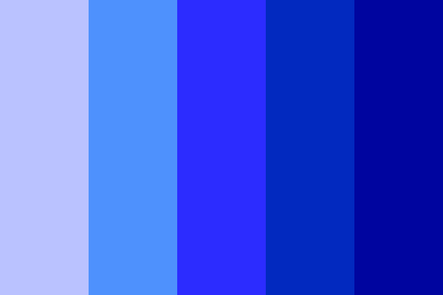
Similarly, there is a trend that is consistent when using the color blue. It is usually associated with calmness, trust, and professionalism. This is because it has the ability to evoke feelings of security, so it makes it a preferred choice for industries such as finance, healthcare, and technology. When working for a brand that aims to instill confidence and reliability in their users, blue is often relied on.
Press enter or click to view image in full size
Let’s take a look at the color green too. It’s deeply connected to ideas of growth, health, and sustainability. It is mostly used by eco-friendly brands and wellness platforms as it often conveys balance and harmony, creating a sense of natural connection. Yellow represents optimism and energy, but it requires careful usage. As much as it can evoke happiness and positivity, it can quickly become overwhelming or hard to read when overused or used in high saturation.
Press enter or click to view image in full size
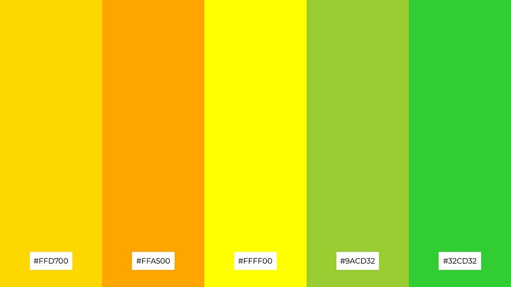
Orange strikes a balance between the intensity of red and the cheerfulness of yellow, exuding enthusiasm, creativity, and approachability. You’ll often see this used in promotions or discount offers to create a sense of urgency while maintaining an inviting tone.
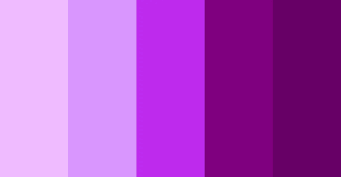
Purple carries an air of luxury, sophistication, and creativity. It is often associated with high-end products or artistic brands seeking to convey elegance and exclusivity. Feminine brands, such as those in the sanitary product space, often use purple for its sophisticated, yet approachable appeal.
On the minimalist side of the spectrum, black symbolizes authority, elegance, and modernity. It is a powerful color for creating sleek, contemporary designs but must be balanced carefully to avoid creating an overly cold or distant feel. Black is usually used black for authority, elegance, and modernity, but must ensure it doesn’t dominate the design. White, on the other hand, symbolizes simplicity and cleanliness. It plays a vital role in creating clarity and spaciousness in my designs, especially in minimalistic designs or backgrounds with high contrast. It enhances the readability of other colors.
Press enter or click to view image in full size

As a designer, it is important to always be mindful that color meanings can vary by culture. People often forget this, but it’s what distinguishes a really good designer. For example, in Western cultures, white is often linked to weddings and purity, whereas in some Eastern cultures, it’s a color associated with mourning and death. Red is a symbol of luck in China, while in Western contexts, it is usually perceived as a warning. This cultural variation highlights the importance of researching your target audience’s background before settling on a final color palette.
Using Color to Influence User Behavior
In addition to evoking emotions, color also has the power to influence behavior and guide users’ actions within a digital interface. This is why it is often used strategically to highlight essential elements, improve engagement, and create intuitive experiences. For instance, vibrant and attention-grabbing colors like red, orange, or green are ideal for call-to-action (CTA) buttons. Green, in particular, is frequently used for success-related actions, such as “Buy Now” or “Proceed,” because it communicates prosperity and security.
Similarly, contrasting colors are used to establish visual hierarchy, making important elements like headings or interactive buttons stand out. A brightly colored button placed against a neutral background naturally draws the user’s eye, directing them to their next step within the interface.
Beyond guiding behavior and evoking emotions, color serves as an essential tool for providing feedback to users. In most interfaces, colors are used to communicate status. For example, green is often used to signal success, such as when a form has been submitted successfully. Red, meanwhile, is widely recognized for indicating errors, like an invalid input field. Yellow or orange can signify warnings or non-critical issues, helping users differentiate between various levels of urgency without overwhelming them.
Brand Consistency
Color plays a critical role in reinforcing brand identity and maintaining consistency. While the key color associations discussed earlier are important, each brand has its own unique identity. Working for a company means adhering to these established guidelines or, in the case of a startup, creating a color scheme that aligns with the company’s vision and message. The most important thing to remember is that color in UI design is not only about reinforcing brand identity but also about respecting color psychology.
For instance, social media platforms like Facebook and Twitter rely heavily on shades of blue to convey professionalism and reliability, while e-commerce giants like Amazon and Shopify use green and blue to assure users of security and prosperity during financial transactions. These choices are intentional and deeply rooted in color psychology.
Ensure Accessibility
While I would dive deeper into accessibility in a separate post, it’s crucial to mention it here. As a designer, you must ensure that interfaces are usable for individuals with color blindness or visual impairments. For example, providing sufficient contrast between text and background colors ensures readability. Additionally, information should not rely solely on color to convey meaning. Icons, text labels, or patterns should accompany color-coded indicators to provide alternative cues for users who may struggle to distinguish certain colors.
Testing color combinations with tools like color contrast checkers and color blindness simulators is a practical step toward creating inclusive designs. Consider tools like WCAG color contrast checkers and Color Oracle to make sure your design is accessible to all users.
In Conclusion
Color in UI design is far more than just a visual element.
Color is a psychological tool that influences emotions, behaviors, and perceptions.
By understanding color psychology and applying it strategically, It has the power to influence emotions, guide behavior, and create a sense of trust. As designers, when we understand color psychology and apply it strategically, we can create interfaces that are not only visually appealing but also intuitive, functional, and emotionally engaging. Whether we’re guiding users toward a specific action, reinforcing brand identity, or evoking a certain emotion, color can take our designs from good to exceptional.
More Readings:
Palmer, S. E. (1999). Color vision mechanisms: Basic aspects. Annual Review of Psychology, 50(1), 27–55.
Kubovy, M. (1997. The psychology of color: A historical introduction. Oxford University Press.
Elliot, A. J., & Maier, M. A. (2007). Color and psychological functioning. Current Directions in Psychological Science, 16(1), 18–22.