AI-POWERED SCHEDULING

A unified billing ecosystem that eliminates payment anxiety

COMPANY

bundul

ROLE

Product Designer

EXPERTISE

UX/UI Design

YEAR

2025

Project Summary

Project Summary

Project Summary

Bundul solves a real problem: people pay many separate subscriptions and bills, each on a different date, and lose track. Bundul brings them together into one managed monthly payment.

The idea was already working when I joined. The product around it was not yet as clear as it could be. People were getting stuck at three points:

  1. Getting started. Onboarding had too many steps and didn't feel like Bundul.

  2. Understanding their money. The report was full of numbers and charts that users had to interpret before they could act.

  3. Sharing with their household. People living together wanted to share subscriptions, but the flow was hard to follow once several subscriptions and several people were involved.

My role

My role

My role

My job wasn't to reinvent the product. It was to find where it was hardest to use and make those parts easy. My design principle: a user should understand what Bundul is telling them without having to work it out.

The before

  1. Too many numbers. The old report put a lot of figures on one screen, and it wasn't clear which ones mattered.

  2. Users had to interpret charts. Before they could decide anything, they had to work out what the charts meant.

  3. It delayed actual consolidation by 46%. Cconsolidation took 46% longer, or 46% fewer users consolidated.

Weather app image
Weather app image
Weather app image
Weather app image
  1. Started from the user's question. "When am I paying for what?" became the job of the report.

  2. Replaced the charts with a calendar. Each day shows which subscriptions are paid, so users can track what they pay for each one across the month.

  3. Cut what didn't answer that question. Numbers that weren't needed were removed or moved out of the main view.

The after

Weather app image

Onboarding

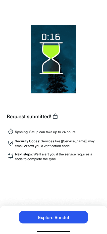
Loader

How I decided to fix

My job wasn't to reinvent the product. It was to find where it was hardest to use and make those parts easy. My design principle: a user should understand what Bundul is telling them without having to work it out.

The before

  1. The loader told users nothing. While Bundul consolidated their bills, they saw a static loader. It showed that the app was busy, but not that anything was being done.

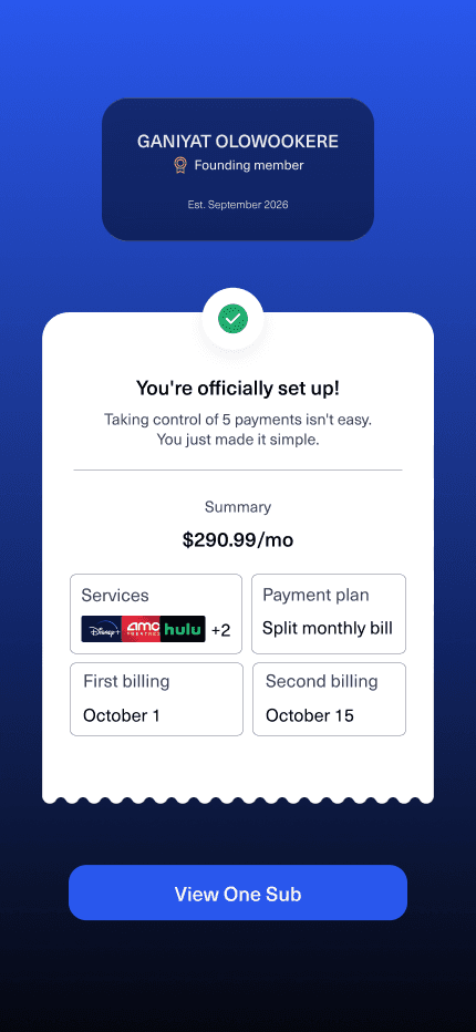
  2. The confirmation asked for more work. Users arrived at the end expecting to be done, and were asked to review their setup instead.

  3. Neither screen felt like Bundul. Brand assets weren't shown, so it felt generic at a moment when users had just handed over their payment details.

Weather app image
Weather app image
Weather app image
  1. Turned the loader into an animated percentage. Users watch the number climb as their bills are consolidated, so they feel that something is really being done in the background.

  2. Turned the review screen into a receipt. It confirms what was set up instead of asking users to check it, so the flow ends on "it's done" with proof.

  3. Added a founding member badge. It marks users as part of Bundul from the start, and gives the ending a moment of welcome.

  4. Brought Bundul's brand into both screens. Colour, logo and type now carry the flow, so it's obvious users are in the right place..

The after

Weather app image

Loader and confirmation

The before

  1. The loader told users nothing. While Bundul consolidated their bills, they saw a static loader. It showed that the app was busy, but not that anything was being done.

  2. The confirmation asked for more work. Users arrived at the end expecting to be done, and were asked to review their setup instead.

  3. Neither screen felt like Bundul. Brand assets weren't shown, so it felt generic at a moment when users had just handed over their payment details.

Weather app image
Weather app image
Weather app image
Weather app image

The after

  1. Turned the loader into an animated percentage. Users watch the number climb as their bills are consolidated, so they feel that something is really being done in the background.

  2. Turned the review screen into a receipt. It confirms what was set up instead of asking users to check it, so the flow ends on "it's done" with proof.

  3. Added a founding member badge. It marks users as part of Bundul from the start, and gives the ending a moment of welcome.

  4. Brought Bundul's brand into both screens. Colour, logo and type now carry the flow, so it's obvious users are in the right place.

Onboarding

Onboarding

The before

  1. It met the minimumaccessibility, so some users were to struggling.

  2. Hierarchy and borders were weak. Nothing told the eye what to read first or which field or button mattered. Inputs and cards blurred into the background.

  3. Bundul's brand assets weren't shown. Nothing looked like Bundul, so it felt generic for an app that handles people's bills and payments.

Weather app image
Weather app image
Weather app image
Weather app image
Weather app image
Weather app image
Weather app image
Weather app image
Weather app image
Weather app image
Weather app image

The after

  1. Fixed the accessibility gaps. I improved contrast, clarified states and made sure fields and buttons were easy to see and tap, so the flow passes comfortably, not by a narrow margin.

  2. Defined borders and containers. Inputs and cards now have clear edges and spacing, so users can see what is tappable and where a field starts and ends.

  3. Put Bundul's brand into the flow. I used the logo, colours, typography and illustration, so it's obvious from the first screen that the user is in the right place.'t shown. Nothing looked like Bundul, so it felt generic for an app that handles people's bills and payments.

Weather app image
Weather app image
Weather app image
Weather app image
Weather app image
Weather app image
Weather app image

Bundul Report

Bundul Report

The before

  1. Too many numbers. The old report put a lot of figures on one screen, and it wasn't clear which ones mattered.

  2. Users had to interpret charts. Before they could decide anything, they had to work out what the charts meant.

  3. It delayed actual consolidation by 46%. Consolidation took 46% longer, or 46% fewer users consolidated.

Weather app image
Weather app image
Weather app image
Weather app image
Weather app image
Weather app image

The after

  1. Started from the user's question. "When am I paying for what?" became the job of the report.

  2. Replaced the charts with a calendar. Each day shows which subscriptions are paid, so users can track what they pay for each one across the month.

  3. Cut what didn't answer that question. Numbers that weren't needed were removed or moved out of the main view. [

  4. Kept it easy to scan. A colour per each day with more subscriotions, a monthly total, a marker for today or the next payment.

Loader and confirmation

The problem

  1. IThe loader told users nothing. While Bundul consolidated their bills, they saw a static loader. It showed that the app was busy, but not that anything was being done.

  2. The confirmation asked for more work. Users arrived at the end expecting to be done, and were asked to review their setup instead.

  3. Neither screen felt like Bundul. Brand assets weren't shown, so it felt generic at a moment when users had just handed over their payment details.

Weather app image
Weather app image
Weather app image
Weather app image

The after

  1. Turned the loader into an animated percentage. Users watch the number climb as their bills are consolidated, so they feel that something is really being done in the background.

  2. Turned the review screen into a receipt. It confirms what was set up instead of asking users to check it, so the flow ends on "it's done" with proof.

  3. Added a founding member badge. It marks users as part of Bundul from the start, and gives the ending a moment of welcome.

  4. Brought Bundul's brand into both screens. Colour, logo and type now carry the flow, so it's obvious users are in the right place.

How I decided to fix

Bundul report

My job wasn't to reinvent the product. It was to find where it was hardest to use and make those parts easy. My design principle: a user should understand what Bundul is telling them without having to work it out.

Key Impact Metrics

Key Impact Metrics

Key Impact Metrics

  • 35% Reduction in Payment Stress: Engineered a unified billing interface that consolidated over 10+ subscription dates into a single payment flow

  • 20% Increase in User Retention: Developed a flexible "Split-Pay" UX feature for balances exceeding £150, directly improving monthly stickiness.

  • 300% Growth in Session Duration: Integrated content discovery tools that boosted average user engagement from 2 minutes to over 6 minutes.

  • Zero-Debt Design Handoff: Optimized high-fidelity workflows in Figma and Webflow to ensure a seamless transition from strategy to engineering

Role & Collaboration

I took end-to-end ownership of the design lifecycle, transforming the platform from a utility tool into a lifestyle hub by integrating content discovery tools. By bridging the gap between engineering and growth teams, I implemented usability changes that boosted average session duration from 2 to over 6 minutes. I utilized a "systems thinking" approach in Figma to ensure the unified billing interface remained scalable across mobile and web platforms while maintaining high-fidelity standards

Create a free website with Framer, the website builder loved by startups, designers and agencies.